Measurements #
URL: /explore
A chart-based view of every measurement Litmus has recorded — filter, scope, and plot. The table-based Results detail Measurements tab is scoped to one run; this view spans the whole index, lets you filter on any facet, and renders the result as a chart.
Use it to ask questions like "what did vout look like across
production runs on bench-3 last week?", "did this measurement
drift when we changed lots?", or "how is the limit margin
distributed for iq across all UUTs?"
When no measurements have been recorded yet, the page shows a
quick-start card with a minimal verify call that will populate it.
Filter section #
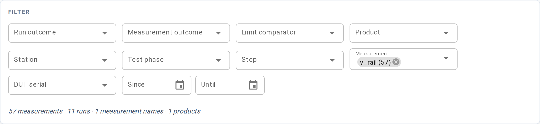
A row of facet widgets, each populated from values actually present in the index. Changing any facet re-fetches the other facets' option lists to reflect what remains available under your current selections (Tableau-style cross-filtering).
| Facet | Filters by | Widget |
|---|---|---|
| Run outcome | The run's overall outcome (passed, failed, ...) | Multi-select |
| Measurement outcome | The individual measurement's outcome | Multi-select |
| Limit comparator | How the measurement is checked (GELE, LE, ...) | Multi-select |
| Part | UUT part number | Multi-select |
| Station | Which station ran the test | Multi-select |
| Test phase | The test_phase stamped on the run (production, validation, characterization, or any project-defined string) | Multi-select |
| Step | The step name the measurement belongs to | Multi-select |
| Measurement | The named measurement (vout, iq, ...) | Multi-select |
| UUT serial | A specific unit | Multi-select |
| Date range | Run start date Since / Until | Date pickers |
A count below the row shows how many measurement rows the current filter set matches, along with the number of distinct runs, measurement names, and parts in scope.
Plot controls #

The PLOT card sits above the chart and decides what gets drawn.
| Control | What it does |
|---|---|
| Y axis | Which field to plot vertically. Required. Fixed columns (e.g. measurement_value, vector_index) appear by their plain name. Recorded input and output fields appear as <name> (input) or <name> (output). |
| Y type | Appears only when the selected Y field has more than one observed value type in the data (e.g. a field recorded as both scalar:float and scalar:int). Pick the type to resolve ambiguity. Hidden when unneeded. |
| X axis | Which field to plot horizontally. Same choices as Y. Required for scatter, line, and bar; ignored for histogram. |
| X type | Same as Y type, for the X field. Hidden when unneeded. |
| Chart | One of scatter (default), line, bar, or histogram. |
| Group by | Optional. Plots one series per distinct value of the chosen column — e.g. group by uut_serial to show one line per UUT. Accepts fixed columns and input/output fields. |
| Bins | Histogram bin count. Range 2–200, default 30. |
| Limit | Maximum row count fetched. Range 10–100,000, default 5,000. |
| Refresh | Force a re-fetch. Filter and control changes already trigger a re-fetch automatically; use this to pick up new runs that arrived while the page was open. |
When Y is unset (or X is unset for scatter, line, and bar), the chart area shows a placeholder until both are selected.
Axis field vocabulary #
The dropdown lists two kinds of entries:
-
Fixed columns — system columns with a single stable name, such as
measurement_value,run_started_at,vector_index,uut_serial. These appear by their plain column name. Internal identity and bookkeeping columns are excluded. -
Input and output fields — fields your tests recorded via
configure()(inputs) andobserve()(outputs). These appear as<name> (input)or<name> (output)— for example,vin (input)orv_rail (output). The label reflects the field's role, not a prefix attached to the name.
Which role an axis field belongs to (input / output / measurement) is
built into the field you pick — vin (input) plots that input,
measurement_value plots the measured value. There is no separate role
control.
Chart #
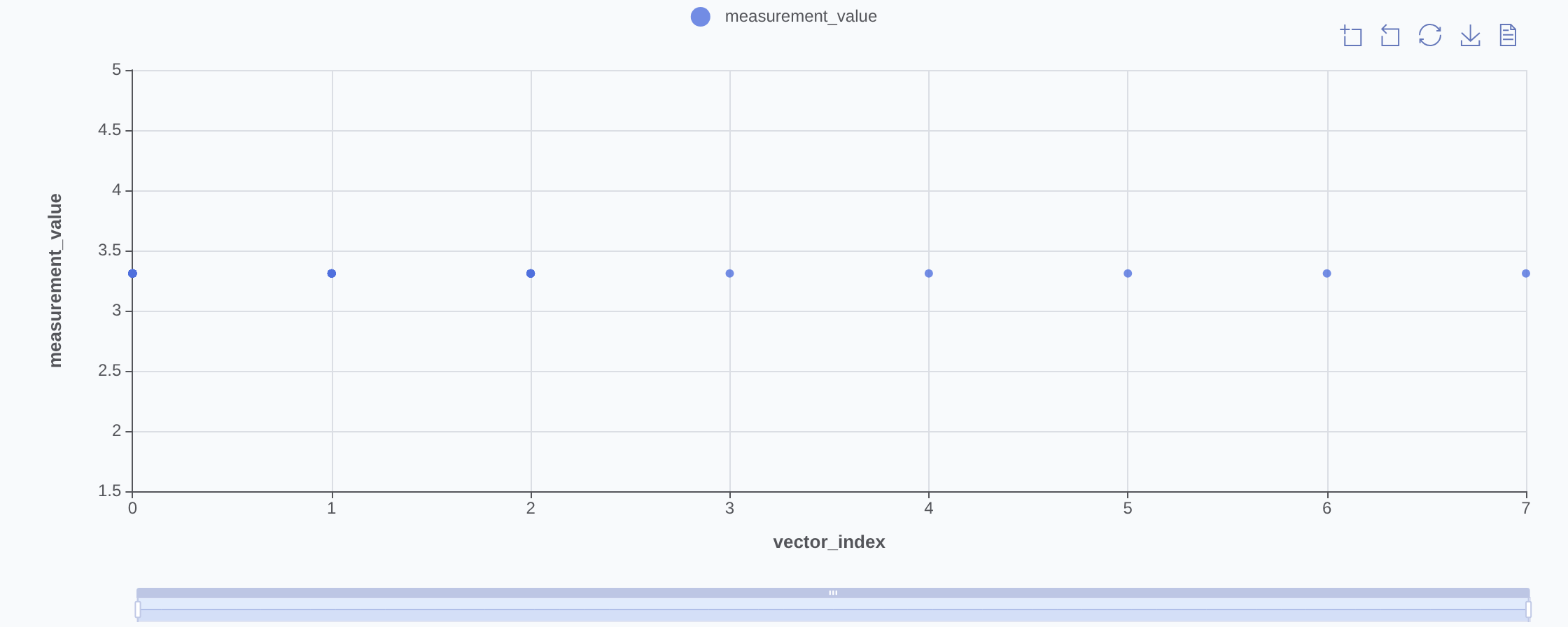
Interactive chart of the filtered rows. The chart kind matches the PLOT control:
- Scatter — one point per measurement row at
(x, y) - Line — points sorted by X and connected
- Bar — bars at each distinct X value, height = average Y at that X (per group)
- Histogram — distribution of the Y field alone (X is ignored), bucketed by Bins count
When the Measurement filter is narrowed to exactly one measurement and Y
is measurement_value, a scatter or line chart overlays that
measurement's limit band as two dashed lines — the low and high bounds
from the most recent finalized run that carries limits. A constant limit
draws flat; a condition-indexed limit (one limit per vector) draws as a
step band tracking the X axis.
When the result set exceeds Limit, only the first Limit rows are returned. Tighten the filter set or raise Limit if the chart looks truncated; very large limits slow rendering.
The chart toolbar (top-right corner) provides box-zoom, reset-zoom, save-as-PNG, and raw-data view.
Live updates #
The view subscribes to run.ended events and re-fetches the active
chart when a run finishes. No manual reload needed.
Bookmarkable URL state #
Every facet, axis selection, and chart setting lives in the URL so a URL captures the exact view.
| Parameter | Meaning |
|---|---|
| Per-facet | Each multi-value facet repeats its query key (e.g. ?measurement_name=vout&measurement_name=iq). Part, Station, and Test phase use the operator-facing keys part, station, and phase — the same keys and values as the Metrics page, so a filtered URL means the same thing on both. |
since, until | Date range, YYYY-MM-DD (omitted when blank) |
y | Y axis when a fixed column is selected (e.g. ?y=measurement_value) |
y_name, y_role | Y axis when an input or output field is selected (e.g. ?y_name=vin&y_role=input) |
y_value_type | Y type override — only present when a field was recorded with more than one value type |
x, x_name, x_role, x_value_type | Same scheme for X axis. x and related params are omitted when chart is histogram. |
group_by, group_by_name, group_by_role | Selected group-by field (same fixed/field split as Y/X). Omitted when blank. |
chart_type | scatter (default — omitted), line, bar, or histogram |
bins | Histogram bin count (omitted at default 30) |
limit | Max row count fetched (omitted at default 5,000) |
Defaults are stripped from the URL to keep it short.
Common tasks #
- Distribution of one measurement — set the Measurement facet to
one value, Y to
measurement_value, Chart tohistogram. The spread shows across all runs in scope. Use Measurement outcome to isolate failures. - One measurement across UUTs over time — set the Measurement
facet, Y to
measurement_value, X torun_started_at, Group byuut_serial. One line per unit. - Swept input vs measured output — set Y to the output field
(
v_rail (output)), X to the input field (vin (input)). Chart shows the transfer curve across all runs. - Compare lots — apply a Date range filter bracketing the lot, or
group by a lot-correlated column such as
uut_lot_number.
See also #
- Results detail → Measurements tab — per-run measurement view
- Metrics → Ppk — process performance ranking across the same data
- Query API reference — the
MeasurementsQueryclass this page calls